
Your Business Logo is often the first impression customers have of your brand, and first impressions matter—a lot. According to a study by Siegel+Gale, simple and clear logos increase brand recognition by 13% and customer loyalty by 6%. This means a well-designed logo doesn’t just look good; it directly influences trust and recall.
A logo serves as a visual anchor for your brand identity. It represents your company’s personality, values, and professionalism in a single glance. In fact, research shows that 75% of consumers recognize a brand by its logo alone. That’s why companies like Nike and Apple invest heavily in their iconic logos—they’re instantly memorable, creating familiarity and trust with audiences worldwide.
For small businesses, the stakes are even higher. A strong Business Logo helps level the playing field, making your brand look credible and trustworthy even if you’re new to the market. Consistent use of your logo across websites, packaging, and social media strengthens recognition and builds a cohesive identity that customers can relate to.
Small Budgets, Big Impact: How Smart Logo Design Can Set You Apart
You don’t need a million-dollar design budget to create an effective Business Logo. Many successful small businesses achieve great results with smart, thoughtful design strategies. In fact, studies show that 60% of small business owners design their own logos, and with modern design tools, you can create professional-quality logos at little or no cost.
The secret is focusing on clarity, relevance, and memorability. A simple logo often outperforms a complex one. Consider this: 95% of the world’s top 100 brands use logos with one or two colors, proving that simplicity makes a big impact. By choosing the right color scheme, typography, and layout, you can create a Business Logo that looks polished, even on a budget.
Free and affordable design tools like Canva, Adobe Express, and Shopify’s logo maker provide customizable templates that make the process easier. With smart design decisions and consistent branding, a small business can project the same level of professionalism as bigger competitors—without overspending.
Understanding Business Logo Design Fundamentals
When designing a Business Logo, understanding the different logo types is key to creating something that fits your brand identity:
- Wordmarks: These logos use the full business name in a stylized font. Think Google or Coca-Cola. Perfect for new businesses that want to build name recognition.
- Lettermarks: Initial-based logos like IBM or HBO. Great for long business names where abbreviations are easier to remember.
- Combination Logos: A mix of text and a symbol—like Adidas or Burger King. This type offers versatility and strong brand association.
- Emblems: Logos with text inside an icon or badge (e.g., Starbucks). Emblems often look traditional and authoritative, making them popular in education and government.
- Icon-Only: A symbol without text, like Apple’s apple or Nike’s swoosh. These work best for established brands with strong recognition.
For most small businesses, a Combination Logo is the safest choice because it combines a name with an image, helping customers connect the symbol to the brand quickly.
Also Read: PPC Strategy: 10 Seasonal Tactics for Growth
What Works: Combination Logos Dominate Fortune 500, Blue Is the Most Used Color
Data shows that combination logos are the most common among Fortune 500 companies, accounting for 61% of top brands. This design choice balances memorability with clarity, making it easier for consumers to associate the icon and name together.
Color also plays a major role in effective logo design. A study by Website Planet found that blue is the most used logo color, appearing in 40% of Fortune 500 company logos. Why? Blue represents trust, professionalism, and stability—qualities every business wants to convey. Red follows closely, symbolizing energy and passion.
When creating your Business Logo, choosing a combination design with a color that reflects your brand personality can significantly increase recognition and consumer trust.
Color Psychology: How Logo Colors Influence Perception and Brand Differentiation
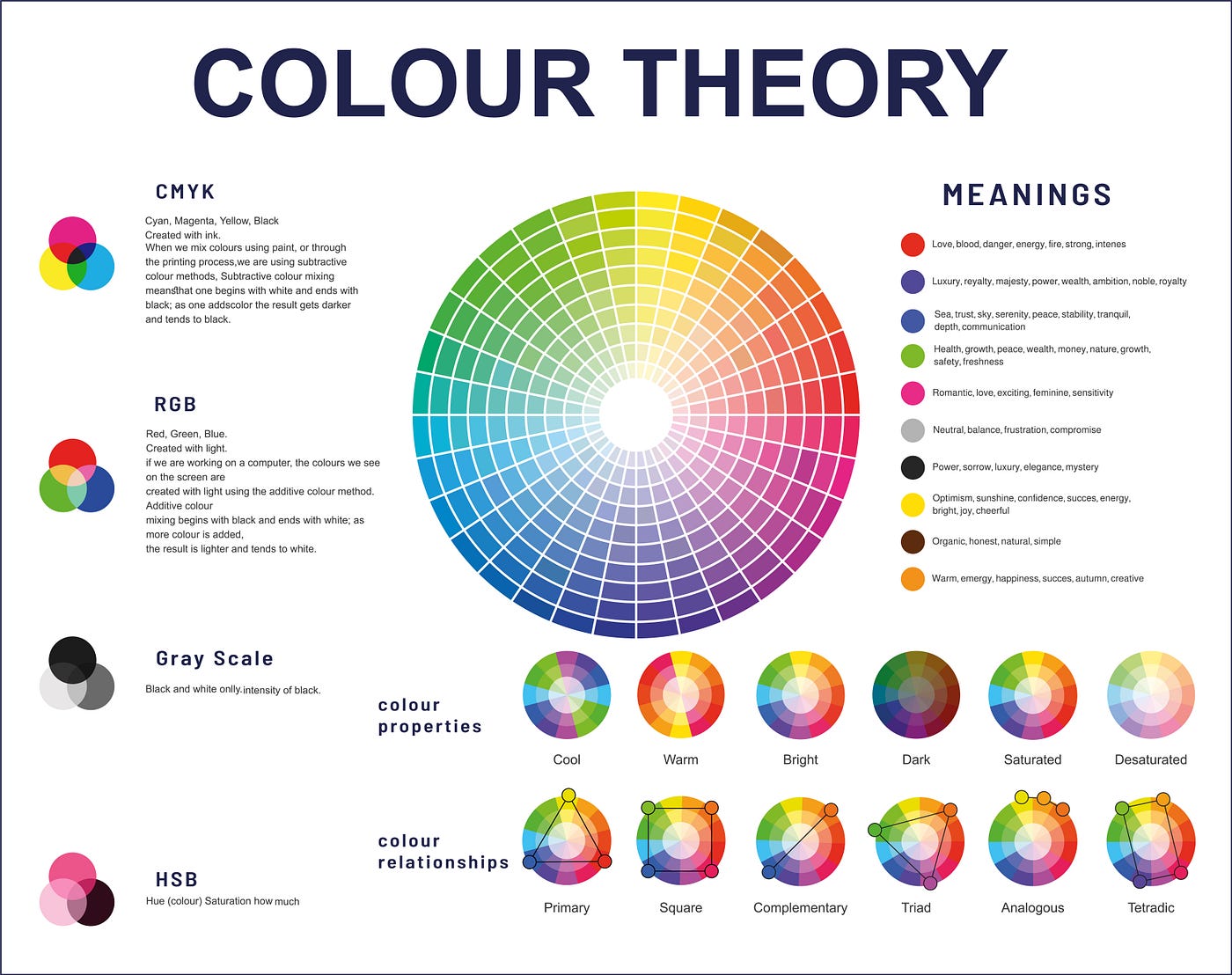
Color is more than decoration—it’s a psychological trigger that shapes how customers perceive your brand. Research shows that color improves brand recognition by up to 80%, making it a critical factor in your Business Logo design.
Here’s what common colors communicate:
- Blue: Trust, security, professionalism (popular with tech and finance brands).
- Red: Passion, energy, excitement (common in food and retail).
- Green: Growth, health, eco-friendliness (ideal for wellness or sustainability brands).
- Black & White: Luxury, sophistication, minimalism (used by fashion and high-end brands).
- Yellow/Orange: Optimism, friendliness, creativity (great for family-oriented or creative businesses).
Picking the right color palette helps your brand stand out while aligning with your core values. For example, a financial services company might lean toward blue for reliability, while a health-focused startup could use green to symbolize wellness.
Developing Your Brand Identity for a Memorable Business Logo
Before designing your Business Logo, you need a clear understanding of what your brand stands for. A logo is not just a graphic—it’s a symbol of your company’s values and personality. Research from Lucidpress shows that consistent branding can increase revenue by up to 23%, and your logo is a core element of that consistency.
Start by answering these questions:
- What are your core values? (e.g., sustainability, innovation, trust)
- Who is your target audience? Knowing their preferences helps guide design choices like color, style, and font.
- What personality traits define your brand? Is it bold and energetic, or elegant and minimal?
For example, a tech startup targeting young professionals might choose a modern, minimalist Business Logo with cool colors like blue or gray, while an organic food brand may opt for earthy tones and nature-inspired icons.
The clearer your brand personality, the easier it becomes to create a logo that truly reflects your identity and resonates with your audience.
Also Read: Topical Authority: Meaning, Importance & How to Build
Conduct Niche and Competitor Research to Align with Trends While Standing Out
Studying your niche and competitors is essential to ensure your Business Logo feels relevant yet unique. According to DesignRush, 42% of consumers say a logo communicates a company’s personality more than any other brand element. That means copying a competitor’s design could confuse customers and weaken your identity.
Here’s how to research effectively:
- Analyze Competitors’ Logos: Look at their colors, fonts, and styles. Are they modern or traditional? Minimal or detailed?
- Spot Industry Trends: For example, tech companies often favor clean, geometric designs, while handmade product brands lean toward rustic or hand-drawn styles.
- Differentiate Your Brand: If all competitors use similar colors, choose an alternative that still fits your brand personality. This helps your Business Logo stand out while maintaining industry relevance.
Staying aware of trends ensures your logo feels contemporary, but adding a unique twist makes it memorable and sets you apart from the competition.
Designing a Clean & Scalable Business Logo
When creating your Business Logo, simplicity is your biggest strength. A simple design is easier to recognize, more memorable, and highly adaptable across different platforms. Research shows that 95% of the world’s top 100 brands use simple logos, proving that minimalism works for global recognition.
A versatile logo should look just as good on a business card as it does on a billboard. Avoid complex details that can get lost when scaled down or reproduced in black and white. Instead, focus on clean lines, balanced spacing, and a clear visual hierarchy.
For example, brands like Nike, Apple, and McDonald’s rely on uncomplicated designs that remain powerful in any size or color format. Following this principle ensures your Business Logo maintains impact whether it appears on your website, social media profile, packaging, or signage.
Ensure Scalability: Icons, Text, and Variations for Different Media
Your Business Logo will appear in countless places—digital ads, product packaging, email signatures, and social media. To maintain professionalism and consistency, your logo must be scalable and adaptable.
This means:
- Vector-Based Design: Always create your logo in vector format (e.g., SVG, EPS) for infinite scalability without losing quality.
- Multiple Versions: Prepare variations such as full-color, black-and-white, horizontal, vertical, and icon-only formats for different applications.
- Responsive Design: A horizontal logo might work on a website header, but for Instagram or app icons, a square or simplified version is essential.
Data shows that 89% of consumers expect consistent branding across all platforms, and your logo is central to that expectation. By ensuring scalability, your Business Logo will look sharp and professional in every format—from a tiny favicon to a large banner ad.
Also Read: 15 SEO Copywriting Hacks to Boost Rankings in 2025
Choosing Colors, Typography & Iconography for a Business Logo
![]()
Color plays a huge role in how customers perceive your brand. Studies show that color improves brand recognition by up to 80%, making it one of the most critical elements of your Business Logo. Choosing the right color palette isn’t just about aesthetics—it’s about psychology and emotional connection.
Here are some proven strategies:
- Blue for Trust & Reliability: Blue dominates 40% of Fortune 500 company logos, making it the most popular choice because it communicates professionalism and security.
- Red for Energy & Excitement: Ideal for brands that want to evoke passion or urgency (common in food and retail industries).
- Green for Growth & Sustainability: A perfect fit for health, eco-friendly, or nature-related businesses.
- Black for Sophistication: Often used by luxury and fashion brands to convey elegance and exclusivity.
Pick 1–3 colors that align with your brand values and maintain strong contrast for readability. The right color combination ensures your Business Logo is not only attractive but also emotionally impactful.
Typography: Reflect Tone (Elegant, Bold, Playful) and Ensure Readability
Typography is the voice of your Business Logo. The font you choose conveys personality before a single word is read. According to design studies, fonts influence brand perception as much as colors, so choose wisely.
- Serif Fonts (e.g., Times New Roman): Communicate tradition, reliability, and authority—great for law firms or luxury brands.
- Sans Serif Fonts (e.g., Helvetica): Clean, modern, and approachable—ideal for tech startups or minimalist brands.
- Script or Decorative Fonts: Stylish and playful, often used in creative businesses or boutique brands. Use sparingly for readability.
Ensure the text remains legible at small sizes and in various formats. Poor readability is one of the most common logo design mistakes, so test your Business Logo across multiple screen sizes and backgrounds.
Icons and Symbols: Reinforce Brand Story—Unique but Meaningful
The right icon can make your Business Logo instantly memorable. Icons provide a visual shorthand for what your brand stands for, but they should feel unique and aligned with your message—not generic clip art.
Best practices for icon design:
- Keep It Simple: Avoid overly detailed illustrations that lose clarity when scaled down.
- Ensure Relevance: A coffee cup icon for a café works; a random abstract shape may confuse customers.
- Add a Creative Twist: Consider symbolic meaning or hidden details that reflect your brand values (e.g., Amazon’s arrow pointing from A to Z for variety).
According to branding research, logos that include a clear, relevant symbol improve customer recognition by 30% compared to text-only logos. A strong icon combined with well-chosen typography creates a balanced and professional Business Logo that tells your story at a glance.
Avoid Common Mistakes in Business Logo Design
One of the biggest mistakes small businesses make when creating a Business Logo is overcomplicating the design. While intricate details might look impressive on a large screen, they often fail when scaled down for social media icons or business cards. Research shows that 78% of successful brands opt for simple logos, which are easier to remember and more adaptable.
Another common trap is relying on clichés—such as generic shapes, overused fonts, or predictable symbols (like a lightbulb for ideas or a globe for international business). These choices make your logo blend in rather than stand out. A unique yet simple design helps create a lasting impression, giving your Business Logo a competitive edge in your industry.
Ignoring Versatility and Real-World Legibility Across Sizes and Media
A great Business Logo should look professional everywhere—on a mobile screen, a billboard, or branded merchandise. Unfortunately, many businesses design for one platform and forget about versatility. This can lead to pixelation, distortion, or unreadable text in smaller sizes.
To avoid this:
- Design in Vector Format: This ensures infinite scalability without losing quality.
- Create Multiple Versions: Full logo, icon-only, horizontal and vertical layouts for flexibility.
- Test on Different Backgrounds: Make sure your logo works in color, black-and-white, and monochrome.
With 89% of consumers expecting consistent branding across all platforms, versatility isn’t optional—it’s essential. A logo that adapts well across print, web, and digital ads strengthens brand identity and builds trust.
Real-World Examples: Inspiring Business Logo Designs
One standout example of clever Business Logo design is a brewery that incorporated its wordmark into the shape of a beer bottle. This approach demonstrates two critical principles: creativity and brand alignment. By integrating the logo text into an iconic product shape, the brewery reinforces what it sells without adding unnecessary elements.
This design works because:
- It’s unique – Unlike generic beer logos, this wordmark shape makes the brand instantly recognizable.
- It tells a story – The logo visually represents the brand’s core offering, creating a strong association.
- It remains simple – Even though the design is creative, it avoids clutter and maintains legibility across all sizes.
For small businesses, this example proves that you can be innovative while keeping your Business Logo clean and versatile.
Also Read: 7 Powerful Google Metrics That Can Boost Your SEO
Other Notable Examples and Lessons from Top Small-Business Logos
Here are a few more inspiring examples to guide your Business Logo design:
- Handmade Jewelry Brand: Uses an elegant script font paired with a subtle gemstone icon to communicate luxury and craftsmanship.
- Eco-Friendly Cleaning Company: Combines a leaf icon with modern typography in green and blue tones to signal sustainability and trust.
- Local Coffee Shop: A minimalist coffee cup outline with steam doubling as a heart shape—a clever way to convey warmth and connection.
Key Lessons from These Examples:
- Keep it relevant: Every element—color, font, icon—should reflect your brand’s identity.
- Stay unique: Avoid common symbols unless you add a creative twist.
- Test versatility: Great logos work equally well on packaging, websites, and social media.
These real-world examples show that a powerful Business Logo doesn’t need complexity or a big budget—just a strong concept that aligns with your brand story.
Tools & Free Templates to Create Your Business Logo
Creating a professional Business Logo no longer requires expensive software or hiring a designer upfront. Thanks to modern tools, you can design a high-quality logo for free or at a very low cost. Here are some of the best free logo makers for small businesses:
- Canva: One of the most popular design tools, Canva offers hundreds of logo templates you can customize with your brand colors, fonts, and icons. It’s beginner-friendly and ideal for creating multiple variations for social media and print.
- Adobe Express: A free tool from Adobe that provides premium-quality templates and creative options. Perfect for businesses looking for more professional customization without steep learning curves.
- Shopify Logo Maker (Hatchful): Designed for entrepreneurs, this tool creates clean, industry-specific logo options in minutes. Great for small businesses that want quick and simple branding.
These tools allow you to experiment with colors, fonts, and layouts until you find the perfect Business Logo that fits your brand identity.
When to Use DIY Tools vs. Hiring Professionals or Investing in Custom Design
DIY tools are excellent for startups or small businesses working with tight budgets. If your goal is to get a functional and decent Business Logo quickly, free tools like Canva or Shopify’s Hatchful are ideal. They help you create professional-looking designs without technical skills or large expenses.
However, there are situations where hiring a professional is worth the investment:
- Complex Branding Needs: If you require a custom-designed logo that sets you apart in a competitive market.
- Trademark and Legal Protection: Professionals can create unique logos that avoid copyright issues.
- Long-Term Brand Strategy: If you’re scaling your business, a custom logo offers a more distinctive identity.
On average, professional logo design can range from $300 to $2,500, while DIY tools cost little to nothing. For most small businesses, starting with a DIY Business Logo and upgrading later is a practical approach.
Step-by-Step Business Logo Creation Process
Designing a Business Logo doesn’t have to be overwhelming. Follow these steps to create a professional and versatile logo that aligns with your brand identity:
1. Sketch Ideas or Use Design Inspirations
Start with brainstorming. Jot down ideas based on your brand values, target audience, and niche. You can also explore design inspiration on platforms like Pinterest or Behance to understand current trends. Sketching by hand helps bring concepts to life before jumping into digital tools.
2. Draft Multiple Variations—Combination, Icon-Only, Vertical/Horizontal
Don’t settle for the first design you create. Instead, make multiple variations:
- A combination logo (icon + text) for primary branding.
- An icon-only version for app icons or social media avatars.
- Horizontal and vertical layouts for flexibility across different media.
Testing these variations early will help you choose the most versatile Business Logo.
3. Test in Real-World Contexts (Website, Social Media, Print)
A logo that looks great on your screen might not perform well in real-world applications. Place your logo on:
- A website header.
- A social media profile image.
- A business card or product packaging mockup.
This ensures your Business Logo maintains clarity and impact across all platforms.
4. Gather Feedback and Revise
Get opinions from your team, loyal customers, or online communities. Ask if the logo reflects your brand personality and if it’s easy to recognize. According to branding research, businesses that collect feedback during design achieve 30% better brand recall.
5. Finalize Versions with Vector Files, Color Codes, and Style Guidelines
Once you finalize your Business Logo, create:
- Vector files (SVG, EPS) for scalability.
- A color palette with hex codes for consistency.
- A mini style guide explaining how to use the logo across digital and print formats.
These final touches ensure your logo remains professional and consistent as your brand grows.
Templates & Downloads: Kickstart Your Business Logo
![]()
To make the process easier, here are free downloadable templates that you can customize for your small business:
- Combination Logo Template: A classic mix of text and icon for strong brand identity. Perfect for websites and signage.
- Icon-Only Template: Great for social media profiles, mobile apps, or minimalist branding.
- Badge/Stamp Shape Template: Ideal for boutique businesses, cafes, or craft brands that want a vintage or official look.
All these templates are editable using free tools like Canva or Adobe Express, so you can:
- Change colors to match your brand palette.
- Adjust typography to reflect your tone.
- Replace icons with ones that tell your unique story.
By starting with these templates, you’ll save time and create a polished Business Logo without the heavy cost of custom design.
Also Read: LinkedIn Ads Broken? Fix It in 12 Easy Steps
Conclusion: Elevate Your Brand with a Killer Business Logo
A strong Business Logo is more than just a design—it’s the face of your brand. Remember these key principles:
- Clarity: Keep it simple and recognizable.
- Personality: Reflect your brand’s tone and values.
- Consistency: Use the same logo across all platforms for strong brand recognition.
- Flexibility: Ensure it works in different sizes and formats.
Now it’s your turn! Grab your free templates and start designing your own standout Business Logo today. Whether you use a DIY tool or work with a professional, creating a logo that resonates with your audience will set your business apart.
